Source: © SocialWire Co., Ltd.
Make your own Demon Slayer logo and text with these three fonts actually used in the anime
- Tags:
- Anime / Calligraphy / Demon Slayer / Demon Slayer: Kimetsu no Yaiba / font / Japanese font
Related Article
-
Eat the cake, Shinji! Layered Evangelion cakes served up in Japan
-
This No-Face Piggy Bank Devours Coins, Burps, And Plays Music
-
The Idolmaster Cinderella Girls’ Sensational Second Collab With Nissin Curry Meshi
-
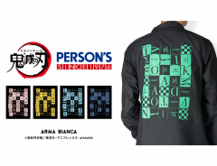
Kimetsu no Yaiba’s Japanese fashion brand collab lets you slay the runway instead of demons
-
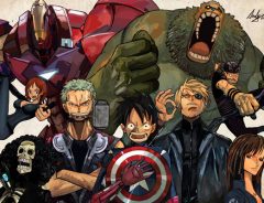
Epic Mashup Recasts One Piece, One Punch Man, And Other Anime Favorites As The Avengers
-

Photographer explores Japanese countryside with shots that look like anime stills

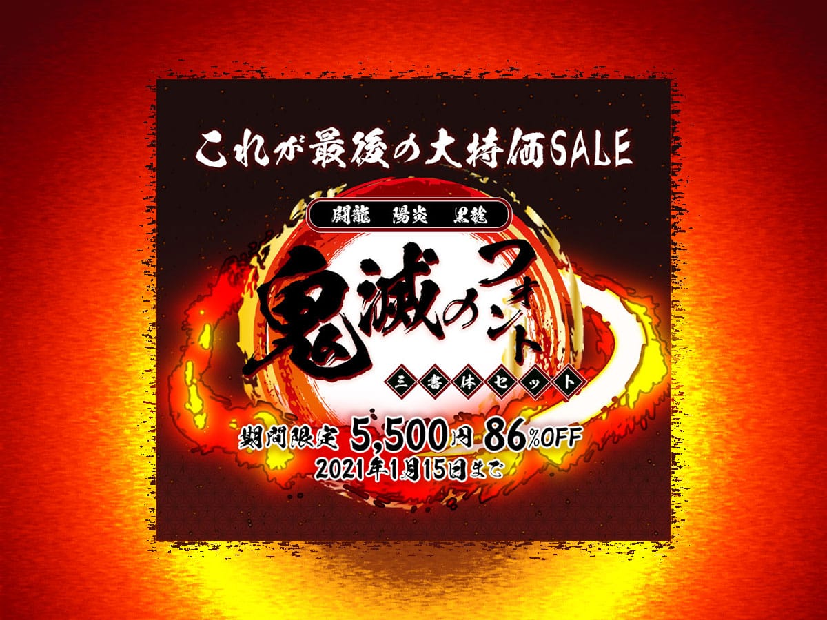
Fans of the megahit manga and anime series Demon Slayer: Kimetsu no Yaiba and even non-fans can probably recognize the logo of the series with its dynamic calligraphic Japanese font. These cool fonts also appear at various times within the anime to identify characters and mark important transitions (openings, endings, etc.) within the story.
According to a press release by Image Navi Co., Ltd., which operates the font site Design Pocket, the popular anime made use of three authentic brushstroke fonts which they happen to own the rights to: Tōryū 闘龍, Kagerō 陽炎 and Kokuryū 黒龍.
Now, for a limited time until January 15th, you can buy all three fonts for the reasonable price of 5,500 JPY (incl. tax), which is 86% off the usual package price of 39,534 JPY (incl. tax).
© SocialWire Co., Ltd.
These three fonts appeared in Episode 22 of the anime when all nine hashira appeared, as well as in the final frame of Episode 26 which concludes the first season.
Consider the image below. The hashiras' types were written in Kagerō font, while their names were written in Tōryū, with the exception of Shinobu in hiragana, which was written in Kokuryū font, and the "mi" 弥 in the wind hashira's first name which was written with Kagerō font:
(Red text in English added by grape Japan)
© SocialWire Co., Ltd.
In the final frame of Episode 26, Tōryū font was used, with the exception of the "no" の in Kimetsu no Yaiba 鬼滅の刃 which was written in Ginryū font 銀龍書体 (not included in this package) and 完 kan ("Fin"), which was written in Kokuryū font:
© SocialWire Co., Ltd.
Characteristics of the three "Demon Slayer fonts"
Let's take a look at these three beautiful authentic brushstroke fonts in more detail.
Tōryū font 闘龍書体
Tōryū 闘龍 means "fighting dragon." Full of fighting spirit, the font is created in the image of a young dragon bursting with energy as it flies through the skies. Although it has power and fierceness, the characters that stretch out in confident brushstrokes fully convey the noble presence of a dragon.
Sample image: "Brush Breathing - First Form: Tōryū"
© SocialWire Co., Ltd.
Kagerō font 陽炎書体
Kagerō 陽炎 means "heat haze." This font is created in the image of a heat haze shimmering close to the ground. As the name suggests, the brushstrokes have fluttering, flame-like fluctuations. At the same time, it has fewer variations in thickness compared to other typefaces, and every stroke of each kanji is carefully rendered.
Sample image: "Brush Breathing - Second Form: Kagerō"
© SocialWire Co., Ltd.
Kokuryū font: 黒龍書体
Kokuryū 黒龍 means "black dragon." Kokuryū font is created in the image of a male dragon flying vigorously in the dark clouds. The contrast between thick and thin lines seem to express the ferocious dragon's emotions. With brushstrokes extending beyond the standard square frame, individual characters may seem unbalanced at first glance, but when assembled as a sentence, they harmonize perfectly and leave a powerful impression.
Sample image: "Brush Breathing - Third Form: Kokuryū"
© SocialWire Co., Ltd.
Here are conventional sentence samples in a horizontal orientation using the three fonts. You can also render text in the Roman alphabet.
From top to bottom: Tōryū 闘龍, Kagerō 陽炎 and Kokuryū 黒龍
© SocialWire Co., Ltd.
Product Information
Kimetsu no Font: Set of 3 typefaces (includes JIS90 character type font and JIS2004 character type font (N))
Updated on May 26th, 2021 to reflect new discount campaign for 2021 and the following disclaimer: When this article was originally published, Design Pocket did not have the sample English phrases currently listed on their website.