
Source: "クロネコ (Kuroneko: Black Cat)" by halfrain is licensed under CC BY-SA 2.0
Yamato Transport to Change Black Cat Logo from April 1st
- Tags:
- Change / Kuroneko Yamato / logo / Yamato Transport
Related Article
-
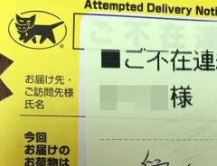
Delivery woman’s message on attempted delivery notice captures hearts online
-

Dancing Black Cats In Suits Are Japanese Shipping Service’s Gift To The World
-

Japanese Twitter users get creative with amusing reinterpretations of new Osaka Expo logo
-
Husband in hot water after receiving a parcel from ‘Your Mistress’
-
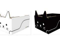
Japanese shipping service packages goods in new cute cat boxes
-

Unedited: High School Girls And Young Women Change Clothes In A Flash!


Yamato Transport (aka Kuroneko Yamato) is well known for its black and yellow logo of a black cat carrying a kitten.
The “Kuroneko” mark, which means safe and courteous, has remained unchanged since it was established in 1957, and has become a familiar symbol for people in Japan.
First Logo Change in 64 Years!
The Yamato Group designed a new logo, which will be used for Yamato Transport from April 1st.
Explanatory text if needed. | © Yamato Transport Co., Ltd.
Wait a second…isn’t that the same as before?, you might have wondered aloud.
It is hard to tell at a glance how it has changed from before.
However, if you compare it closely with the mark in the below photo, you can notice the slight changes.
"YAMATO TRANSPORT CO., LTD. (ヤマト運輸株式会社 Yamato Un'yu Kabushiki-gaisha)" by Michael Francis McCarthy is licensed with CC BY 2.0.
The black border around the logo is gone, and the cat now has two legs instead of four.
According to Yamato Transport, the new logo has been refined to be more “future-oriented” that “expressed our intention to further evolve the services that we have been providing day in and day out, while harmonizing and blending in better with the environment of cities, towns, and regions.”
In addition to the existing logo, a new “Advance Mark” has also been established.
© Yamato Transport Co., Ltd.
According to Yamato Transport, the new logo symbolizes the company’s vision and stance on taking on challenges in an evolving society, unconstrained by conventional thinking. It will be used when developing new services and businesses.
© Yamato Transport Co., Ltd.
© Yamato Transport Co., Ltd.
Reactions to the news of the logo change have been mixed.
Some say the logo is just fine as it is, while others prefer the new logo.
After 64 years, it makes sense that there’s a little controversy around the symbol change, but as long as the quality of service doesn’t change we’ll all survive right?